Friday 15 April 2011

Promotional Pieces


Just a separate flyer and poster I did up on Illustrator for a promotional item for my invented Ski company 'Descender'.

Monday 11 April 2011

Tuesday 5 April 2011

The Meal Range


This is my design for the range so far, working with a pastel colour palette and a playful font choice. I included the back of one of the microwave meal sleeves just to show how I'm planning on laying out the type. I'm hoping making the packaging itself/actually finding a template for it wont be too hard...

My God I'm Indecisive


So after creating several different solutions to our food packaging brief incorporating my Alsatian character Gramsci, I decided that I'm bored of working with him now and went back to work with my original ink drawings. These pictures as the result of those ink drawings being Live Traced in Illustrator. I'm going to design a range of healthy microwave meals for kids incorporating them. As you do.

Revised Final Dust Jacket


TA-DA! Spoke to my tutor today, figured out a few minor tweaks that I had to take care of and after a little time spent on Illustrator I'm finally done. Finito. Le Fin etc etc. I'm pretty happy with the outcome anyway. I still might come up with another solution to it yet, depending solely on time. Last month of college is always horrible for trying to meet a million fricking deadlines.

Monday 4 April 2011

Food Packaging


So in our Ideas Generation class we have to make our own food packaging based around the character we designed for a previous project. My character was a communist people-eating Alsatian. So naturally I decided to design packaging for vegetarian sausages. This is what I got so far. It's going to be for a pretty standard cardboard rectangular box (we physically have to make the packaging ourselves and given my 'craft' skills, I'm not aiming too high).

Colour?


Quickly threw some colour on it there in Photoshop. Also did one with more text, kinda clarifying the joke. Hmm not sure which one I prefer though...

And again...


Decided that I still wasn't happy with the first part of the chimera brief so I did it out again. The landscapes weren't exactly a major effort and I'm fully aware that I'm capable of better. So hopefully this is better. I drew around a photo of a lip gloss that I had from the first day with the Pen Tool in Illustrator then manipulated it to look like a gun. I coloured it in with the Live Paint Bucket and using the Blob Brush Tool drew around the 'pen' outline again loosely in order for it to look handdrawn. I then drew a soldier holding the gun using the Blob Brush Tool again. The speech bubble was also drawn with the Blob Brush. The font for the caption is called 'Rift3d' and I got it off the make-your-own font site fontstruct.com. I think this piece is much more representative of my own personal style than the last two that I did as I'm generally quite illustrative and tend to work in flat colour/monochrome. I still might throw a background colour on this though.

Saturday 2 April 2011

The Final 3


So these are my final three book cover designs for our typography brief. They're all pretty similar, there's just minor differences in detail. On the first one I have increased the font size on the back for children's legibilty, on the second I have kept my original colouring idea of a plain white background on the cover and finally on the third I have changed that background colour to a nice pastel blue to complement the orange typeface and darker cornflower blue outline of the front cover rhino. I'm not sure whether I should include a review quote at the bottom or not though.

The Grand Finale...


So after all that, this is my final dust jacket design. Overall, I'm pretty happy with it, I just hope it meets all of the brief criteria.

Font play


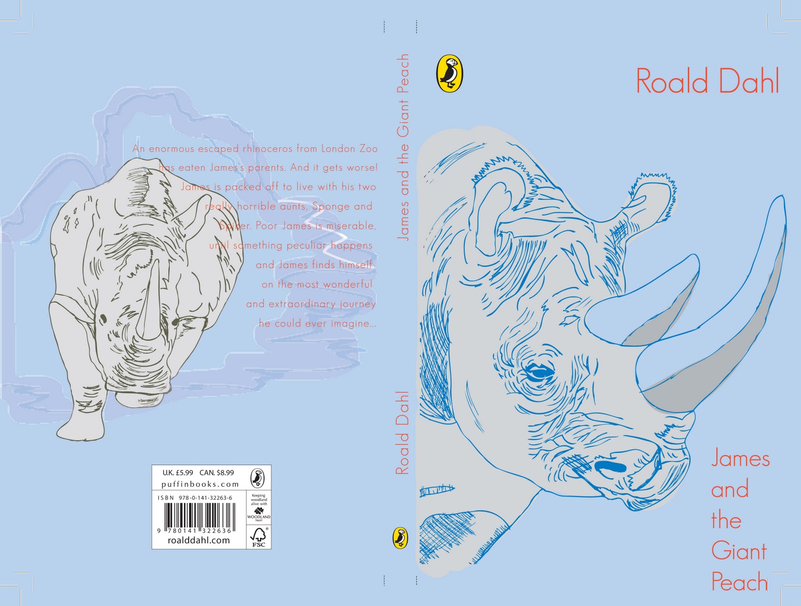
These are all just me playing around with various type solutions. I downloaded various 'handwritten' and calligraphic fonts I liked in the end as my handwriting is completely illegible even to myself most of the time. I got some off the site Dafont.com and the remainder off Fontstruct.com. I played around with warping the type different ways in Illustrator. I also simply moved the type around the front cover to see which layout I liked best. I'll post up my final cover in a seperate post so that you may view it in all its glory...(someone needs to come up with a font to convey sarcasm)